Thursday, April 22, 2010

dem map

This map shows elevations in 3D

http://edc.usgs.gov/images/dem.jpg

range graded proportional circle map

http://www.d.umn.edu/geog/cartfolder/HTML%20Pages/Prop-Symbol2.htm

This map is when the size of the circle goes with the size of the population, so the bigger the circle, the higher pop.

DOQQ


A digital orthophoto quadrangle (DOQ) is a computer-generated image of an aerial photograph in which image displacement caused by terrain relief and camera tilts has been removed. It combines the image characteristics of a photograph with the geometric qualities of a map.

http://www.isgs.uiuc.edu/nsdihome/webdocs/doqs/images/charleston_q30.jpghttp://www.isgs.uiuc.edu/nsdihome/webdocs/doqs/images/charleston_q30.jpg

Isobar

this map is a line on a weather map connecting points of equal atmospheric pressure. Canbe useful in determining high and low pressure which form storms and storm tracking


Friday, April 9, 2010

Isohyets

These maps use lines to show rainfall. You can see by the colors and numbers the amount of fall each year. This is very good in keeping record of the rain fall per season.

DRG MAP

http://www.forestpal.com/images/drg.gif
These maps are scanned topographical maps, and include the same detail as the topographic map.

Cartographic Animation


This map is a frozen picture of an animation that shows a movement in the information it is trying to depict. Another good esample is the weather forecast, when you see the storms moving in.

Statistical maps

These maps are numerical data. It groups it into sections based on that. This map is on the local authority in the UK.
http://www.scotland.gov.uk/Resource/Img/37432/0008378.gif


Monday, April 5, 2010

Isopleths


http://www.arb.ca.gov/newsrel/isopleth.jpg

This map generalizes and simplifies data. This one for example shows how much diesel being released is leading to cancer effects in california.

Isopach


This is an areal map, that is used a lot for looking for things such as oil and underground structural analysis.

Isotachs

http://www.zamg.ac.at/docu/Manual/SatManu/Exercises/JeCl/images/jf2qspa00.gif

This map shows the upper atmosphere and thee jet streams. It is a wind map.

Wednesday, March 31, 2010

classed choropleth map


This map uses smaller intervals to portray the data. There is a scale and is usually broken into color differnces to match the area on the scale.

Bivariate Choropleth Map


A bivariate map displays two variables on a single map by combining two different sets of graphic colors. This shows two different information at the same time. This isa gif animation that shows the two.

Univariate Choropleth Map


dISPLAYS ONLY SINGLE VARIABLE. THIS IS SHOWING THE POVERTY IN THE US.

standardized choropleth maps


Unstandarizied Choropleth


This map shows hazaderous waste. Unstandarizied Choropleth maps are maps where the data has not been averaged. The data is presented in numerical values.

Tuesday, March 30, 2010

DLG


http://ga.water.usgs.gov/olympics/columbus.dlg.gif
THese are digital line graphs that show boundaries, roads, and other various information found on topographical maps.

DLG


http://ga.water.usgs.gov/olympics/columbus.dlg.gif

LIDAR

http://coralreefs.wr.usgs.gov/images/lidar_map.jpg
LIDAR stands for Light Detection and Ranging. This type of remote sensing employs the use of laser light to help gather images. It stands for Light Detection and Ranging. This type of remote sensing employs the use of laser light to help gather images.

Nominal Area Choropleth Maps


This type of data is quantitative and random and broken into different colors . The different colors represent variations in data. Most will havea key onthe side to see where the colors fall.

Saturday, March 20, 2010

Bilateral graph


By using two colors and comparing right next to each other you can really tell the difference in this graph.

Lorenz curve

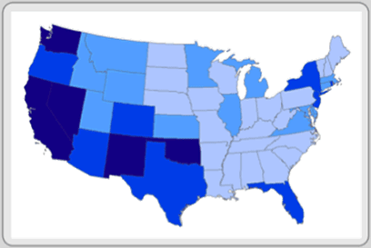
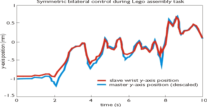
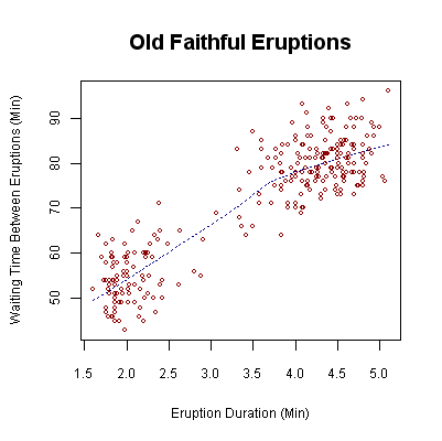
This graph is used to display probility distribution. This one shows the total population compared with the total income.

index value plot

http://content.ll-0.com/pmimassbay/word_images/2925232_image003.gif?i=021307053031

This kind of plot is where a value is actually plotted and not numbered.

Popluation profile


this compares the total population with a specific date, for example, in this graph, it is what age the population is.

Triangular plot

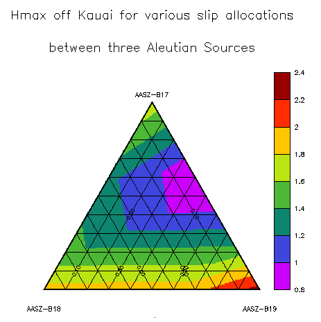
THis shows data in different colors and by putting them all in one space it is easy to compare.

Parallel coordinate graph


This graph displays multiple data on one graph. You can distinguish them by the color.
http://www.iwi.uni-hannover.de/lv/seminar_ss05/bartke/Assets/parall2.jpg

histogram


These show frequence on a specific topic by labeling what and how much. And then using lines and colors to distinguish.

box plot


http://math.youngzones.org/boxplot.gif

these maps show the range of the data. You can see this by the extension of the box.

stem and leaf plot

This map is used to show different numerical data.

similarity matrix

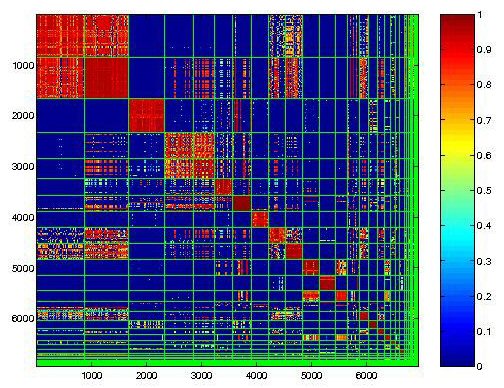
These types of maps show how similar things are. The levels of similarity are show by boxes and colors. Red-the most, Blue-the least.

http://cgi.mtc.sri.com/Cluster-Lab/01.jpg

Coorelation matrix


These maps compare how well two things correlate. http://www.image.ucar.edu/GSP/Projects/JunIPCCModelBiasCorrelations.jpg

Star Plot


Star plots allow you to compare different types of data for various experiments or designs. This shows a lot in the by using masses.

www.spider.ipac.caltech.edu


Mental Map

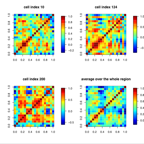
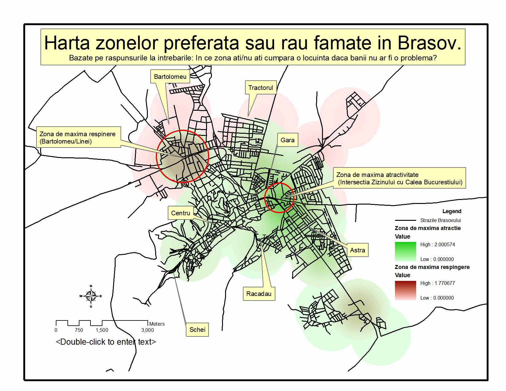
This map shows areas that zone into places that you have to go into your visable past to recall.

Sunday, February 21, 2010

Isoline map

These maps show different temperatures by connecting the colors (or lines) together.

Dot Distribution Map


I liked this map because it is easy to see the population density with the dots, because of the color contrast.

Cadastral Map


This map shows the real property lines and bounds.

Thematic Map


This map shows population density by using different colors. Can be a good source of information but sometimes can be very vague.

http://transit-safety.volpe.dot.gov/publications/safety/samis/samis98/1998map.gif

Planimetric Map


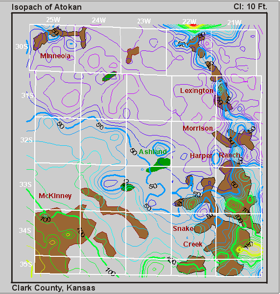
The difference between this and a topographic map is that there are no vertical elevations of any kind on a planimetric map.

http://www.geocraft.com/WVFossils/PageMill_Images/image184.gif


This map is used to determine the temperature and inches of percipitation in this location in Colorado. I find it useful for when determining the best time to visit places.

Saturday, February 6, 2010

Hypsometric maps


These maps show elevation with bands of color and a key to let you know the elevation. I like this map because it is very detailed!

Proportional Circle maps


This map lays out how many housing per community area. By laying out the circles in the different areas in different sizes with a key on the side, you are able to tell the amount.

Infrared aerial photo


This image can be very useful because it shows temperature which can determine depth and height.

soil map


I found this map interesting because it shows where the different types of soil is located.

windrose


This is especially useful to boaters and air services because they determine the wind direction and speed.

choropleth map


These maps usually are divided by colors and charts on popluation ratio or based on low income, and shaded that way.

Doppler Radar


The doppler radar map, I feel, is especially important. I know this because living in South Florida we encounter a lot of storms, and this is an accurate way to try to prepare ahead of time. This is also used a lot in the midwest, and all over the country.

Saturday, January 16, 2010

Scatter Plot


This scatter plot shows waiting time between eruption and duration of eruption.

Flow Map


This map was used in French wine exports. I feel it shows clear defination of the map, and the "flow' of distribution.

Propaganda Map

This map is a propaganda map and was used by the Germans to produce fear. I feel this is a good propaganda map because it is being used to portray what they want to portray!

Monday, January 4, 2010

Topographic Map


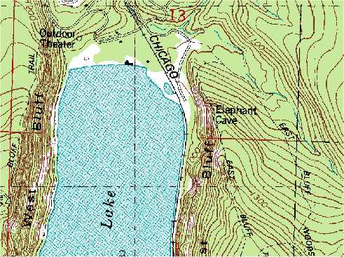
A Topographic Map is basically a large-scale map showing relief and man-made features of a portion of a land surface distinguished by portrayal of position, relation, size, shape, and elevation of the features.
In this map you can see all indents, which indicate elevation in not only the land but also in the water.