
This map uses smaller intervals to portray the data. There is a scale and is usually broken into color differnces to match the area on the scale.


 LIDAR stands for Light Detection and Ranging. This type of remote sensing employs the use of laser light to help gather images. It stands for Light Detection and Ranging. This type of remote sensing employs the use of laser light to help gather images.
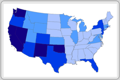
 This graph is used to display probility distribution. This one shows the total population compared with the total income.
 http://content.ll-0.com/pmimassbay/word_images/2925232_image003.gif?i=021307053031
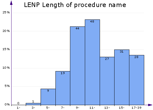
 THis shows data in different colors and by putting them all in one space it is easy to compare.

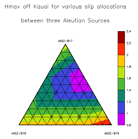
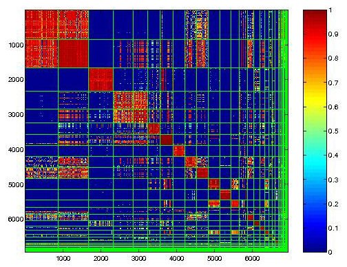 These types of maps show how similar things are. The levels of similarity are show by boxes and colors. Red-the most, Blue-the least.
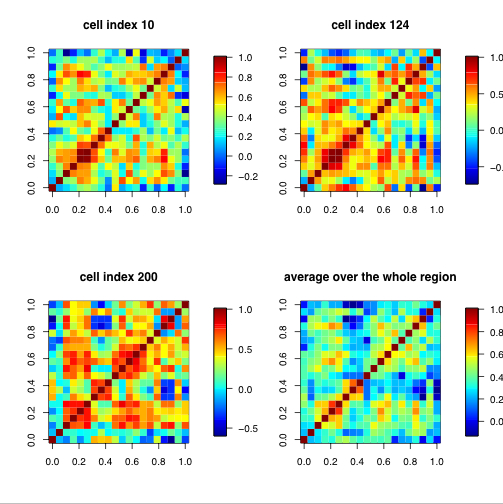

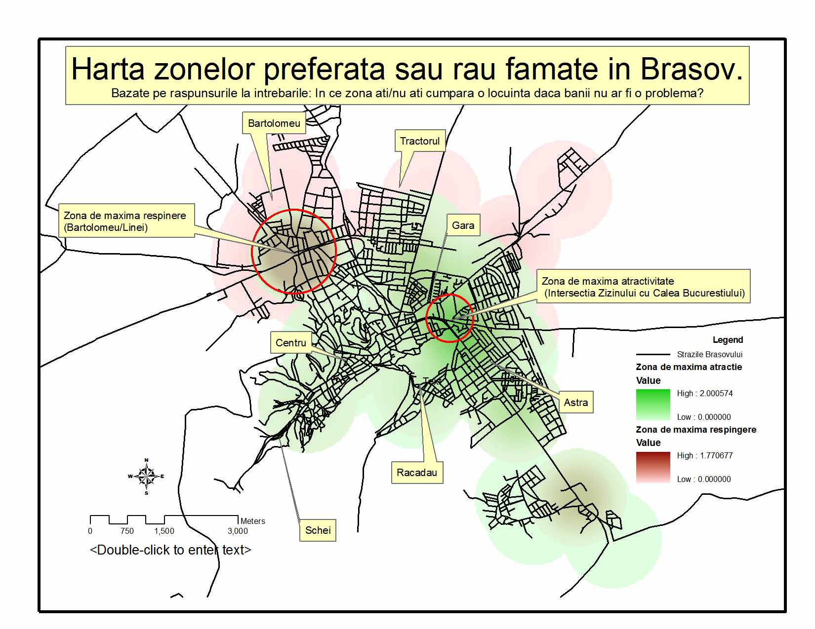 This map shows areas that zone into places that you have to go into your visable past to recall.
